Statistics can be a powerful tool when performing the art of Data Science (DS). From a high-level view, statistics is the use of mathematics to perform technical analysis of data. A basic visualisation such as a bar chart might give you some high-level information, but with statistics we get to operate on the data in a much more information-driven and targeted way. The math involved helps us form concrete conclusions about our data rather than just guesstimating.
Using statistics, we can gain deeper and more fine grained insights into how exactly our data is structured and based on that structure how we can optimally apply other data science techniques to get even more information. Today, we’re going to look at 5 basic statistics concepts that data scientists need to know and how they can be applied most effectively!
Statistical Features
Statistical features is probably the most used statistics concept in data science. It’s often the first stats technique you would apply when exploring a dataset and includes things like bias, variance, mean, median, percentiles, and many others. It’s all fairly easy to understand and implement in code! Check out the graphic below for an illustration.
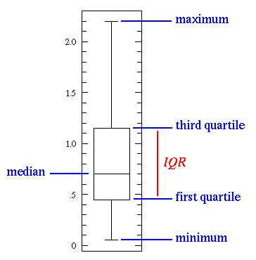
The line in the middle is the median value of the data. Median is used over the mean since it is more robust to outlier values. The first quartile is essentially the 25th percentile; i.e 25% of the points in the data fall below that value. The third quartile is the 75th percentile; i.e 75% of the points in the data fall below that value. The min and max values represent the upper and lower ends of our data range.
A box plot perfectly illustrates what we can do with basic statistical features:
- When the box plot is short it implies that much of your data points are similar, since there are many values in a small range
- When the box plot is tall it implies that much of your data points are quite different, since the values are spread over a wide range
- If the median value is closer to the bottom then we know that most of the data has lower values. If the median value is closer to the top then we know that most of the data has higher values. Basically, if the median line is not in the middle of the box then it is an indication of skewed data.
- Are the whiskers very long? That means your data has a high standard deviation and variance i.e the values are spread out and highly varying. If you have long whiskers on one side of the box but not the other, then your data may be highly varying only in one direction.
All of that information from a few simple statistical features that are easy to calculate! Try these out whenever you need a quick yet informative view of your data.
Probability Distributions
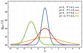
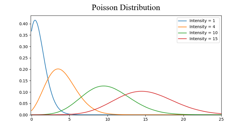
We can define probability as the percent chance that some event will occur. In data science this is commonly quantified in the range of 0 to 1 where 0 means we are certain this will not occur and 1 means we are certain it will occur. A probability distribution is then a function which represents the probabilities of all possible values in the experiment. Check out the graphic below for an illustration.
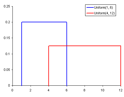
- A Uniform Distribution is the most basic of the 3 we show here. It has a single value which only occurs in a certain range while anything outside that range is just 0. It’s very much an “on or off” distribution. We can also think of it as an indication of a categorical variable with 2 categories: 0 or the value. Your categorical variable might have multiple values other than 0 but we can still visualize it in the same was as a piecewise function of multiple uniform distributions.
- A Normal Distribution, commonly referred to as a Gaussian Distribution, is specifically defined by its mean and standard deviation. The mean value shifts the distribution spatially and the standard deviation controls the spread. The import distinction from other distributions (e.g poisson) is that the standard deviation is the same in all directions. Thus with a Gaussian distribution we know the average value of our dataset as well as the spread of the data i.e is it spread over a wide range or is it highly concentrated around a few values.
- A Poisson Distribution is similar to the Normal but with an added factor of skewness. With a low value for the skewness a poisson distribution will have relatively uniform spread in all directions just like the Normal. But when the skewness value is high in magnitude then the spread of our data will be different in different directions; in one direction it will be very spread and in the other it will be highly concentrated.
There are many more distributions that you can dive deep into but those 3 already give us a lot of value. We can quickly see and interpret our categorical variables with a Uniform Distribution. If we see a Gaussian Distribution we know that there are many algorithms that by default will perform well specifically with Gaussian so we should go for those. And with Poisson we’ll see that we have to take special care and choose an algorithm that is robust to the variations in the spatial spread.
For more information on this article: